Client
Latkowski
Role
UI/UX Designer
Category
E-commerce, B2C
Redesigning salt lamp e-commerce to boost sales and improve user experience
From chaos to clarity
Company overview
Latkowski is a family-owned business from the Świętokrzyskie Mountains, specializing in Himalayan salt lamps and wellness products for over 30 years.
Challenge: lost in the user experience
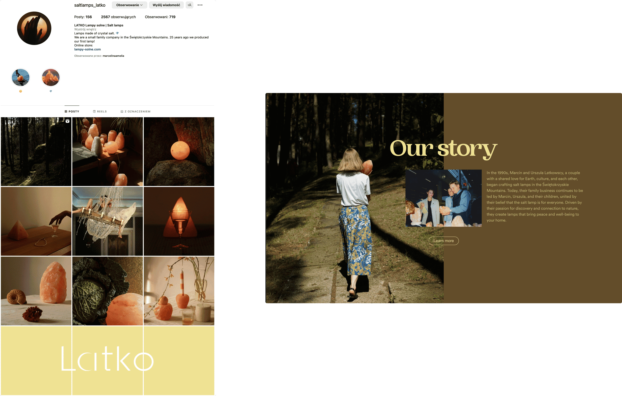
The e-commerce site was confusing to navigate, frustrating users, and hurting sales. A lot of customers came from Instagram, but the website didn’t match its look. This mismatch created a disconnect for visitors.
Redesign impact
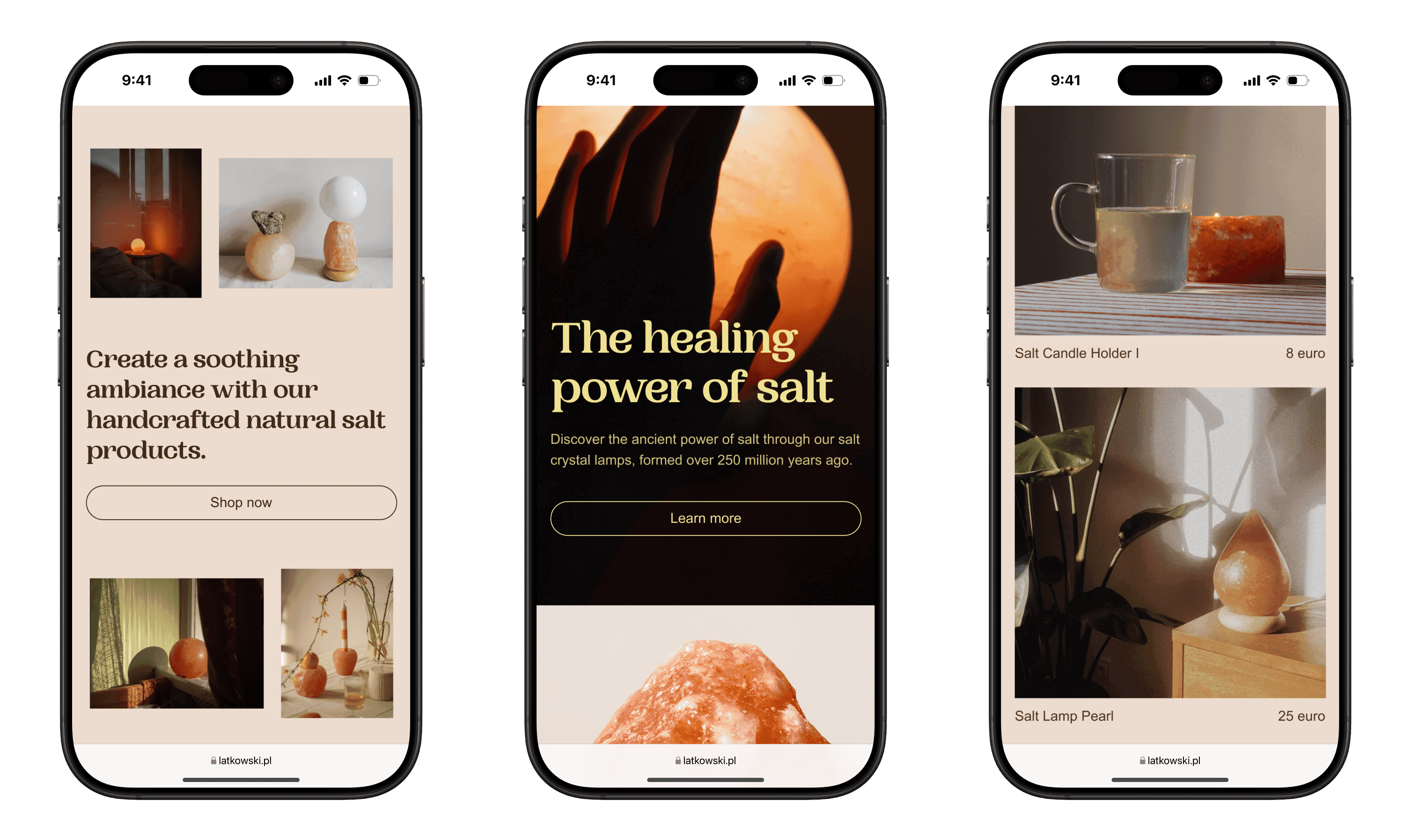
With the redesign of Latkowski's e-commerce website, I aimed to improve business performance by streamlining navigation to help customers find products more quickly. This would enhance the shopping experience and potentially boost sales. Additionally, I focused on creating a consistent brand look across the website and social media, with the goal of strengthening brand identity and building customer trust and engagement.
Uncovering hidden opportunities
Understanding users and conversion
I developed user personas based on research into competitor sites and user behavior, identifying key frustrations and shopping habits. I mapped key user flows with a focus on improving product discovery to boost conversion rates.
Simplified navigation
I streamlined the site map, reducing unnecessary pages, creating a clearer layout, and simplifying user flows.
Consistent branding
I aligned the website’s look with the brand’s Instagram aesthetic, creating a unified feel across both platforms and maximizing its potential.
UI redesign and delivery
Design System
I built a Design System including reusable components (buttons, fonts, colors) for a consistent, scalable UI that could grow with the brand.
Content strategy
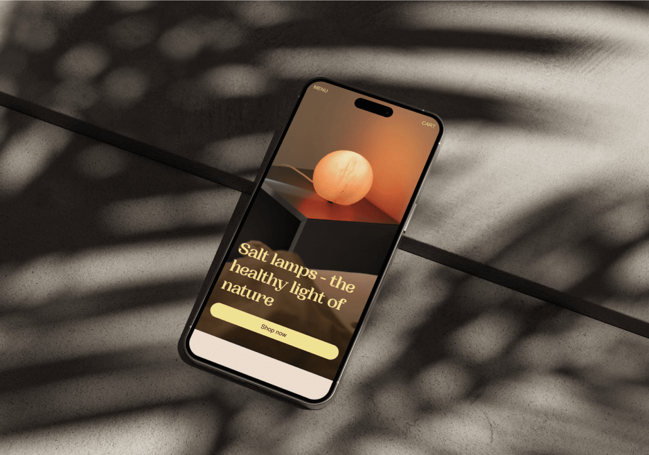
I developed a content strategy within the mockups for clear communication. I focused on a mobile-first design to ensure the website is responsive across all devices and screen sizes.
Prototyping and testing
I created and tested user flows to ensure the layout was intuitive. After gathering feedback from 3 users, I implemented necessary changes. I also prototyped features like hover effects on product tiles to clearly communicate requirements to developers.
Documentation for handoff
Although the project didn’t reach the development stage, I prepared the design documentation and would provide support to developers to ensure the website was built as planned.
This project is a personal passion project. Images are sourced from lampy-solne.com and the Instagram account @saltlamps_latko. It is not intended for commercial use, and all credits go to the respective owners.


