Client
Lustery
Role
Lead Brand Designer
Category
Adult entertainment, B2C
How a strategic rebrand boosted Lustery sign-ups
Project background
Company overview
Lustery is a creator-centered sex-tech startup and media company offering a subscription-based video streaming platform for real-life couples, serving over 700K members worldwide.
Team
Product Owners, Head of Marketing, Head of Content, Lead Developer, Product Manager, Backend Developer, Junior Developer, Copywriter, Graphic Designer, Digital Marketing Manager, Social Media Manager
Why did Lustery need a change?
From unclear identity to a unified vision
Lustery's dual role as a video platform and educational blog caused confusion due to a lack of cohesive brand identity and visual strategy. A rebrand was essential to align the team, build trust, and position Lustery as a leader in ethical, diverse intimacy while supporting its rapid growth.
The impact
The rebrand led to a significant boost in new user sign-ups, a noticeable increase in Instagram engagement, and positive user feedback on the brand’s inclusive, welcoming, and modern approach.
The transformation process
Brand workshop for strategic alignment
I led a workshop with key stakeholders to define Lustery’s vision, mission, values, target audiences, and platform differentiation, laying the foundation for a cohesive visual identity.
Crafting a modern visual identity
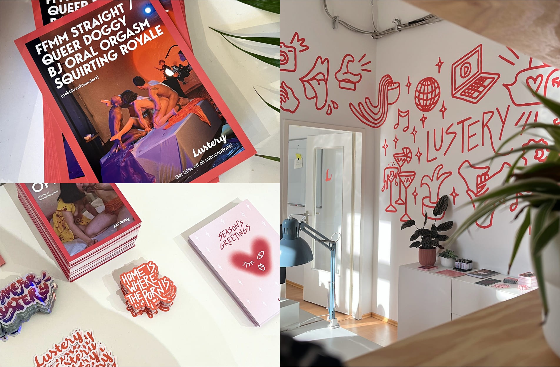
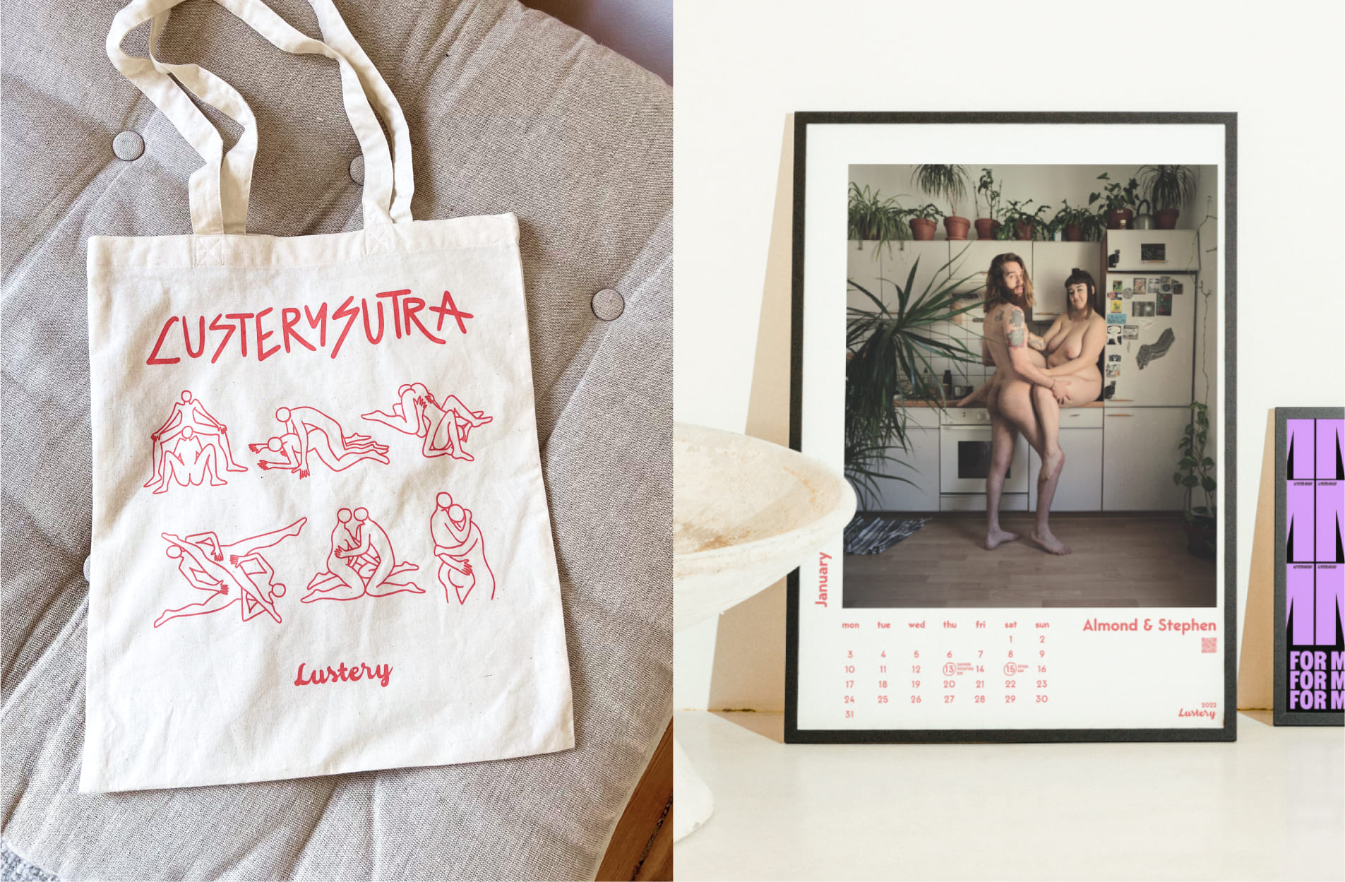
Based on the insights, I developed a refreshed visual identity. The design was bright, welcoming, and comforting, with inclusive representation and handmade illustrations that highlighted the human aspect. Consistent visual elements, such as logos, typography, and the color palette, were integrated across the platform.
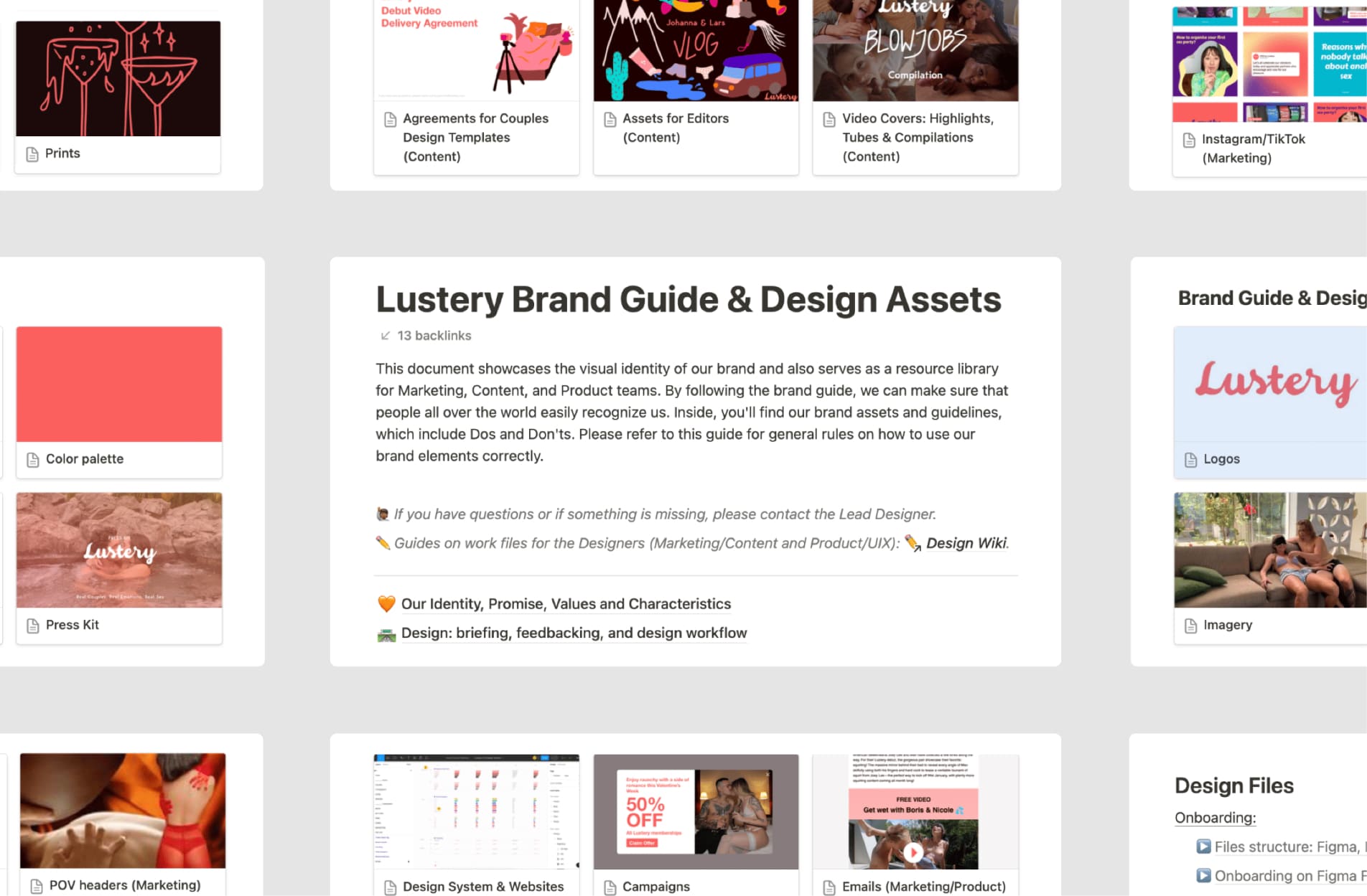
Notion-based brand guide
I developed a scalable brand guide with templates for videos, social media, press kits, emails, and campaigns, ensuring design consistency across all systems.
Creating assets at scale
I produced hundreds of assets aligned with Lustery’s refreshed identity, including social media visuals, campaign materials, marketing assets, and a website redesign.
Crafting visual language for key campaigns
In addition to creating assets for regular campaigns like Valentine’s Day and Black Friday, I led the visual direction for 4 major awareness campaigns: Pornographers, Masturbation Month, Lustery Awards, and How to Watch Porn.
"How to Watch Porn" Campaign (2023)
This campaign aimed to educate and engage audiences on ethical content consumption. I collaborated across marketing, content, and product teams to deliver a responsive landing page, course materials, blog visuals, learning materials, email campaigns, and graphics and animations to amplify reach and engagement.


