Client
Lustery
Role
Lead UI/UX Designer
Category
Adult entertainment, B2C
Building a Design System for Lustery – a fast-growing video platform
Project background
Company overview
Lustery is a creator-centered sex-tech startup and media company offering a subscription-based video streaming platform for real-life couples, serving over 700K members worldwide.
Team
Lead Developer, Product Manager, Junior Developer
Entering a messy and inconsistent ecosystem
Lustery was struggling with design chaos that affected all teams. Every new feature or page introduced inconsistencies, making development slow and vulnerable to mistakes. The lack of a unified design approach caused frustration for both developers and the marketing team, who relied heavily on design support even for minor updates.
My goal was to create a unified, scalable design system to improve collaboration between design, development, and marketing, while ensuring brand consistency.
My core responsibilities and project impact
Design System creation
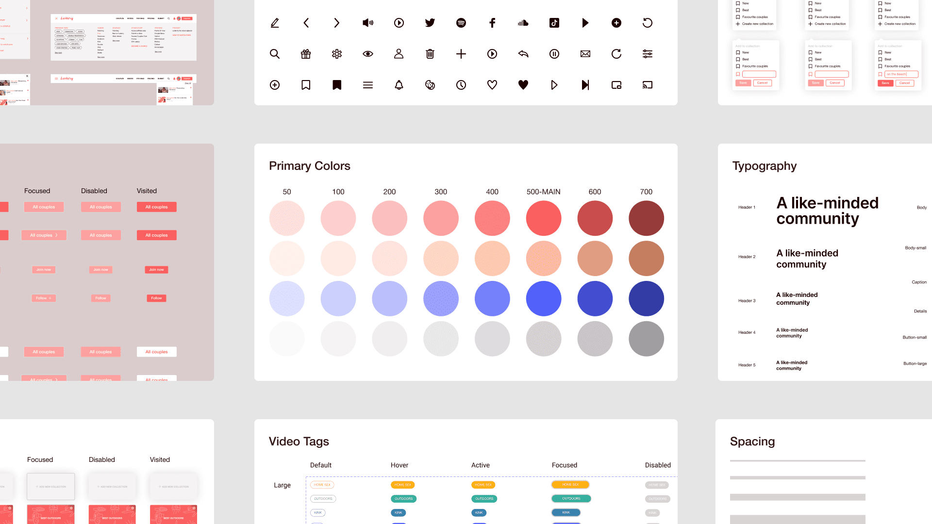
I built a design system from scratch, covering everything from typography, colors, and icons to more complex components like buttons and navigation.
New branding
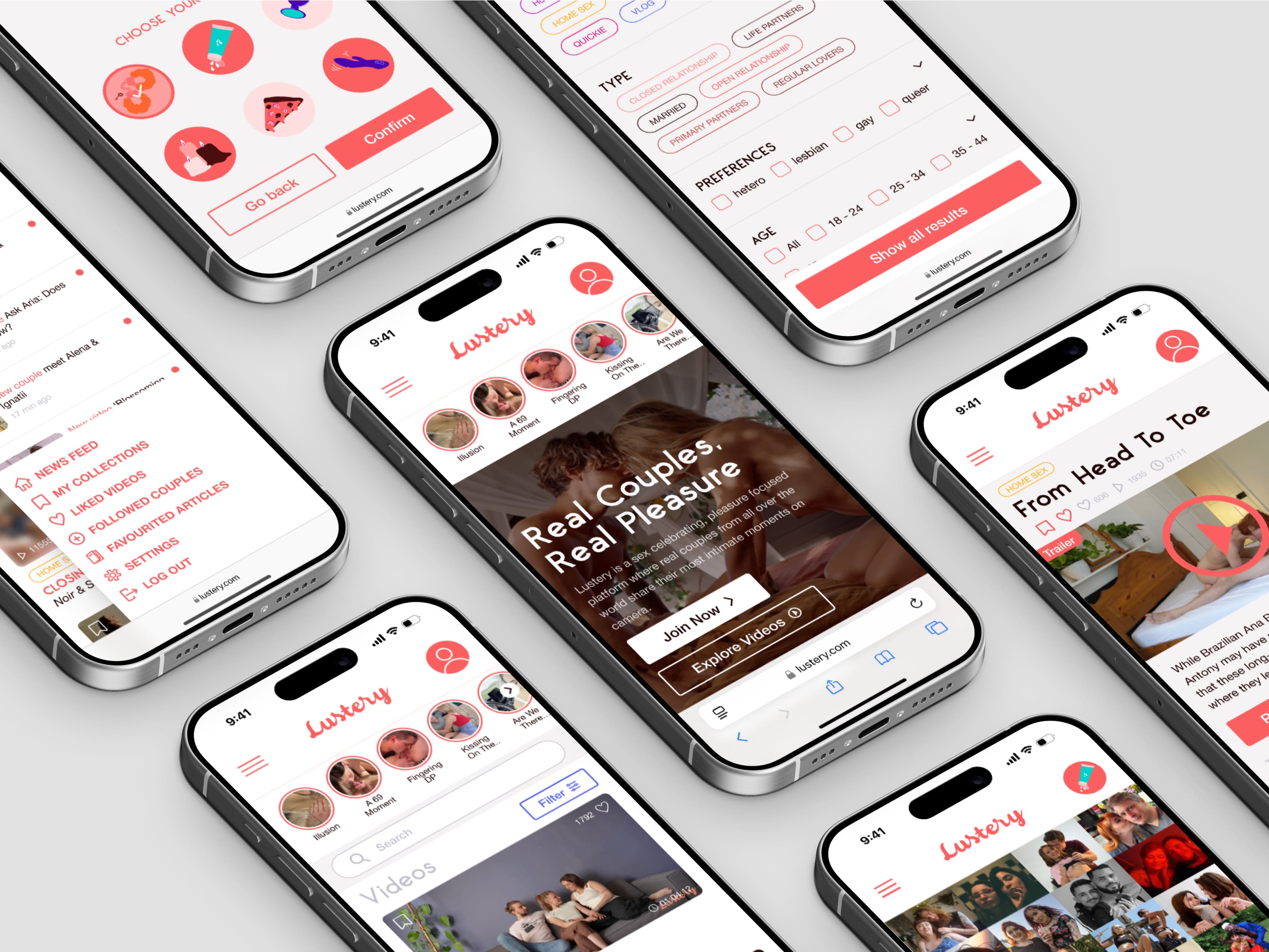
I refreshed branding and integrated it with Lustery's design system to ensure consistent visuals across the platform.
Team efficiency
The Design System streamlined workflows by fostering collaboration between development and marketing, reducing repetitive design requests and speeding up development.
Marketing independence
I created easy-to-use templates and guidelines, allowing the marketing team to make independent updates without needing design input.
Clear documentation & rollout
I documented the design system in Figma, making it easy for all teams to use. This helped implement it smoothly across projects, improving consistency and teamwork.

