Client
Lustery
Role
Lead UI/UX Designer
Category
Adult entertainment, B2C
Improving Lustery's search and filtering experience to increase retention
Project background
Company overview
Lustery is a creator-centered sex-tech startup and media company offering a subscription-based video streaming platform for real-life couples, serving over 700K members worldwide.
Team
Product Owner, Lead Developer, Product Manager, Backend Developer, Head of Marketing, Head of Content, Junior Developer, Copywriter
Discovery and define
Objective
As the UI/UX Lead at Lustery, I proposed gathering detailed user feedback and insights through Hotjar analytics and usability testing for our platform. My goal was to plan product design improvements based on prioritizing user needs and a data-driven approach.
Usability testing
I conducted remote testing sessions with different user groups (newcomers/potential users, basic users, and premium long-term users) to identify their main frustrations.
Data analysis
I used marketing analytics and worked with Hotjar's heatmaps and session recording tools to understand user behavior and guide our design improvements.
Key issues of frustration
The search and filtering tools were ineffective, making it hard to find content.
It was difficult to explore the content library, as it repeatedly showed the same videos, offering little variety.
We regularly lost potential users, basic users didn’t upgrade to premium subscriptions, and many premium users canceled their subscriptions.
Redesign and launching process
UI changes
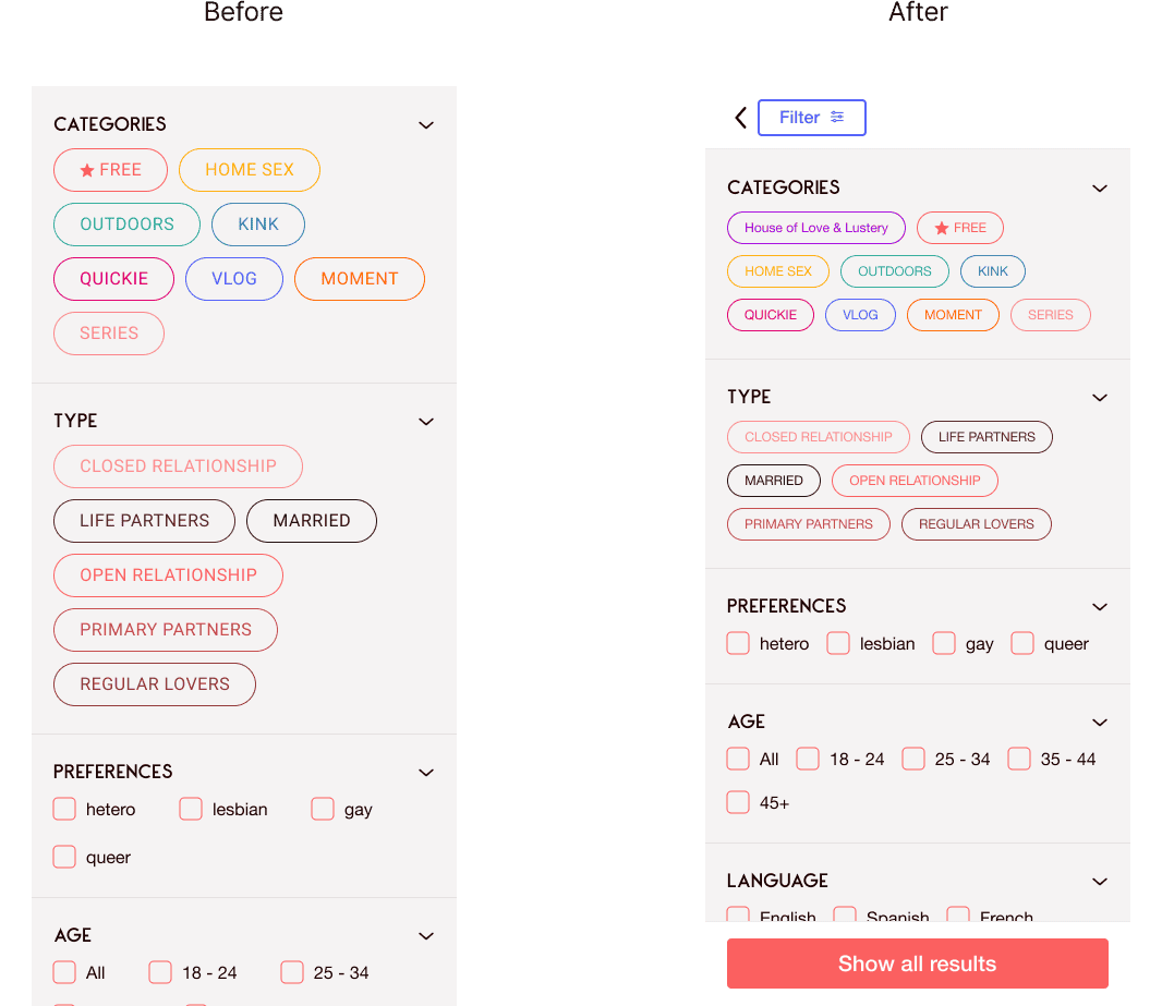
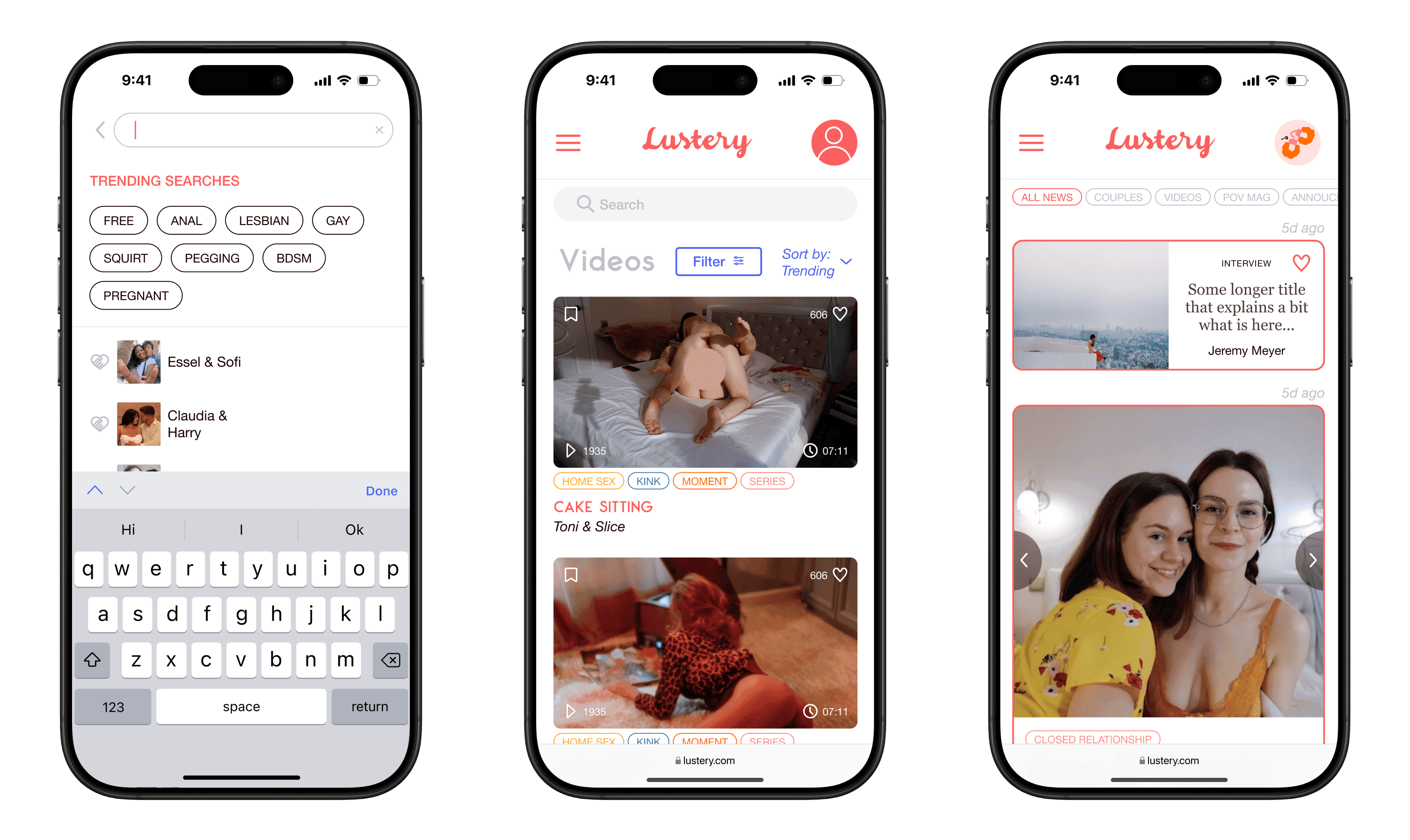
I updated the UI with a focus on the mobile experience, including dynamic search results, a global search feature, a revised filtering menu, and a new search results page. I simplified filtering and search flows by reducing the steps to find content and improving visual clarity.
Prototypes
I created prototypes to test new features and adjusted based on tests feedback.
Collaboration with developers
I worked closely with the development team, providing clear documentation and ongoing support throughout the launch.
Impact and measurements
Increased User Satisfaction and Engagement
I collected feedback from customer service and used Hotjar’s heatmaps to understand how users felt about the updates and how they interacted with the new features.
20% Increase in Retention
Using Google Analytics, we tracked the number of users who returned to the site before and after the redesign. We also monitored the number of users who unsubscribed during this period.
Higher Conversion Rates
The marketing team reported that more users upgraded from basic to premium subscriptions after the changes.


